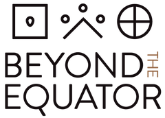
When we first started brainstorming our logo, we knew we wanted to incorporate our experience farming in South America into the identity of our brand. The experience of going “Beyond the Equator” and coming back with exciting insights is at the core of our culture and we wanted that message present in our logo. We narrowed down our experiences in South America to two main concepts: farming of the land and learning from the culture. From these two points we chose to make the content of our symbols about the experience of farming while having the culture and art of South America inspire the aesthetics.
After we decided what we wanted our symbols to represent, we shifted our focus to designing the figures and shapes themselves. Our main goal was to find inspiration from the aesthetics of South American artistic styles out of respect toward all that we learned from farming and working there. Drawing from books, websites, and personal experiences, we created an assortment of designs for our symbols and eventually settled on the three we use today.
Depicted in the first symbol is a seed enclosed in a square representing earth. Second is an open triangle representing a mountain with three small circles representing rain. The third symbol is a circle with a cross through the middle, representing the sun. Collectively, the symbols portray the natural resources needed to farm: seed, earth, rain, and sunlight.
After much work and deliberation, we completed the three symbols we use today. Our hope is that we can use our story and experience behind the symbols to spread awareness of all that South America has taught us, especially when it comes to ancient grains and farming.
Now that you know our story, check out the products that we've created!


